
Let’s say we want to change the looks of all buttons in our application.
We want them to have a black background and text inside to have white foreground.

WPF gives us a Style infrastructure to do just this. But, as often happens with WPF, we can achieve this in many different and confusing ways.
Let’s make some order out of the chaos.
Solution #1: Explicit styles
Explicit style means you’ll have to explicitly write the style for each button. This is best done with a WPF Resource like this:
<Button Style=”{StaticResource BaseButtonStyle}“>Hello world</Button>
And in App.xaml you’ll have the resource itself:
<Application.Resources>
<Style x:Key=“BaseButtonStyle” TargetType=“Button”>
<Setter Property=“Background” Value=“Black”/>
<Setter Property=“Foreground” Value=“White”/>
</Style>
</Application.Resources>
NOTE: We can write both TargetType=”Button” and TargetType=”{x:Type Button}”. Both will work for built-in WPF controls.
And the result is:
Resources defined in App.xaml are available everywhere in the application.
We can write the style once and simply add Style=”{StaticResource BaseButtonStyle}” everywhere.
But we wanted to do this to all buttons, right? Isn’t there something that does this to all buttons automatically?
Worry not, WPF has Implicit styles just for this.
Solution #2: Implicit styles
The Microsoft folks did think of a way to apply a resource automatically. You simply need to omit the x:Key in the style and it will be applied to all Controls of type in TargetType.
In App.xaml:
<Application.Resources>
<Style TargetType=“Button”>
<Setter Property=“Background” Value=“Black”/>
<Setter Property=“Foreground” Value=“White”/>
</Style>
</Application.Resources>
In your Window / Control:
<Button>Hello world</Button>
And the result is:
This is called Implicit Style.
Looks great, right? So I’m all set?
Well… not quite yet. Let’s say you want to add somewhere Padding as well in style.
If you write something like this
<Button>
<Button.Style>
<Style TargetType=“Button”>
<Setter Property=“Padding” Value=“20”/>
</Style>
</Button.Style>
Hello world
</Button>
Wait… I see the padding, but where did my Background and Foreground go??
Well, you’ve actually overridden your style.
If you did want to use the original style as well, you could write something like this:
So the Implicit Style option looks pretty good. You just have to always remember adding one line of code when you’re changing styles
Consider this: WPF does give default style to a button. It includes a default template, a default Background, default padding and so on. And when you add a Style, these aren’t overridden.
You can create a Default style yourself as well. But it has to be your own Custom Control. You will not be able to change WPF’s built-in controls` default style.
Solution 3: Default styles
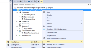
As I said, your own Default Styles can be applied only to Custom Controls. And actually, WPF takes care of this pretty much automatically when you add a new item.
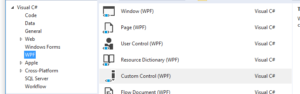
Let’s add a Custom Control
Select a WPF Custom Control
Let’s see what changes happened in the solution
- A new class appeared
- Themes\Generic.xaml was added to your project
In there you’ll see style was added for your control.
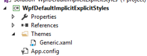
Generic.xaml is a special file that contains your default styles. You can’t rename it or move it to a different directory.
It is also loaded before your app.xaml resources. So you can’t rely on them if using StaticResource. (Use DynamicResource).
In the Themes directory you can add themes for specific Windows theme. For example adding Aero.NormalColor.xaml means when Windows is in Aero style, these resource file will be loaded.
- If you open Properties\AssemblyInfo.cs you’ll notice this line was added:[assembly: ThemeInfo(ResourceDictionaryLocation.None, ResourceDictionaryLocation.SourceAssembly )]
This line is also essential. It tells the assembly to load Themes\Generic.xaml and use it for default styles.
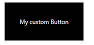
Let’s try using our default style and see what happens.
First, I wanted a button, so let’s derive from Button:
This code will show this

Great so far but what if I set the style to something else? Will the default style be overridden? Let’s try:
Finally… Perfection!
Summary:
- In your application you’ll probably have a project just for your custom controls. Make sure to use Default styles for those controls, not Implicit or Explicit styles. It will make your life easier.
- Instead of using WPF’s built-in controls, prefer using Custom Controls. This will allow you using Default styles and you’ll probably want to set your own Template anyway.
WPF’s default template adds a lot of noise you’ll want to remove or customize anyway. For example triggers for Focus, MouseOver and so on that change the appearance.
Generic.xaml is like magic. Make sure your team knows how it works or they will get stuck and end up creating ugly hacks that will cause bugs and annoy everyone.
More articles:
- Check out WPF Merged Dictionary problems and solutions to see how you can use Merged Dictionaries to spread your resources across many XAML files (and all the problem WPF has in store for us).
- Check out WPF complete guide to Themes and Skins to see how to add Themes to your WPF app.


